Better Reporting Experience for Small eCommerce Businesses
TradeGecko is an inventory and order management software for small businesses with multi-channel
Year
2018My Role
Product DesignerSkills I Used
User ExperiencePrototyping
User Interface
User Interview
The Problem
TradeGecko is a company with SaaS business model - we provide a cloud-based inventory management and in return our users pay us a monthly or annual subscription. One of the perennial issue we were trying to solve was the problem of customer churn. A popular hypothesis in SaaS is that as you increase customer stickiness, churn will naturally decrease.
Many of our users rely on reporting to monitor health of business and aid in decision-making. While a dashboard and reporting feature have existed in TradeGecko for awhile under the "Intelligence" section, the adoption of these features remain low.
My Role
Thus our team was formed: a Product Manager, one designer (yours truly), and two engineers. We were tasked with improving the dashboard and reporting experience so that it provides useful insights, which in turn increase adoption of the Intelligence section and increase stickiness.
My responsibilities for this project include:
- Proposing experience that could increase adoption of Intelligence
- Creating a testable prototype for usability testing
- Lead user interview / usability testing
- Iterating on the high-fidelity design after testing and prepare for handover to development
The Discovery Process
We started by combing our JIRA tickets to find some patterns. A common feedback we saw was that our users often didn't know how to generate the report they wanted. In addition to that, the Dashboard was not providing valueable insights. It was not immediately clear how the business was doing from first glance. These issues have stopped our customers from using reporting and the Intelligence section in general.
The Design
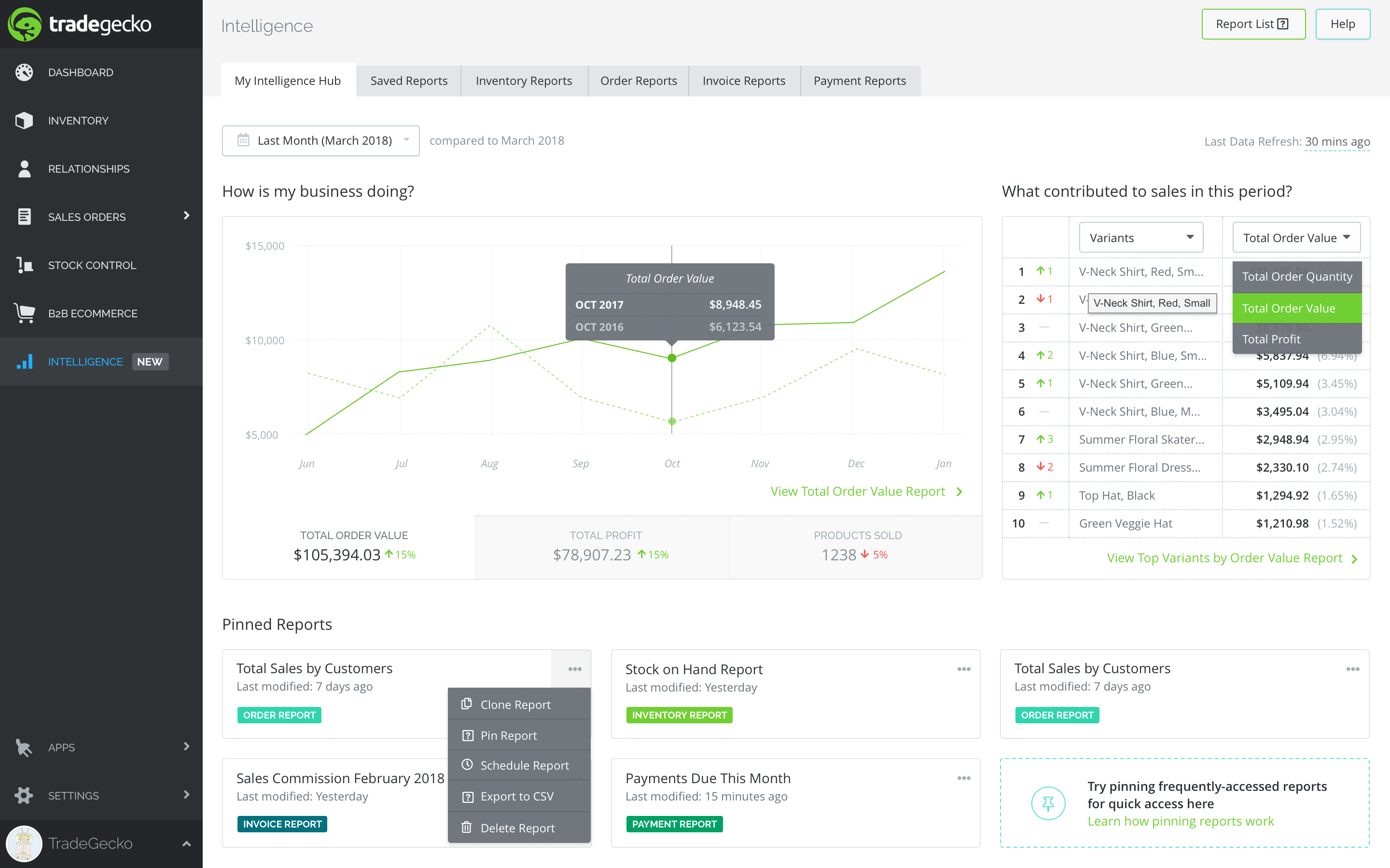
Dashboard
The new dashboard immediately answered the two most asked question: "How is my business doing?" and "What contributed to sales?". I went with a simple design of a graph with a customizeable leaderboard on the right side. The graph serves as a visual so that they can quickly see the trend of their business performance (total order value, profit and products sold) over a specified period of time. The leaderboard offers a quick way to navigate through what has contributed to sales the most - in just a few clicks, they can navigate from the top variant, customer, locations, as measured by order value or order quantity.
Reporting
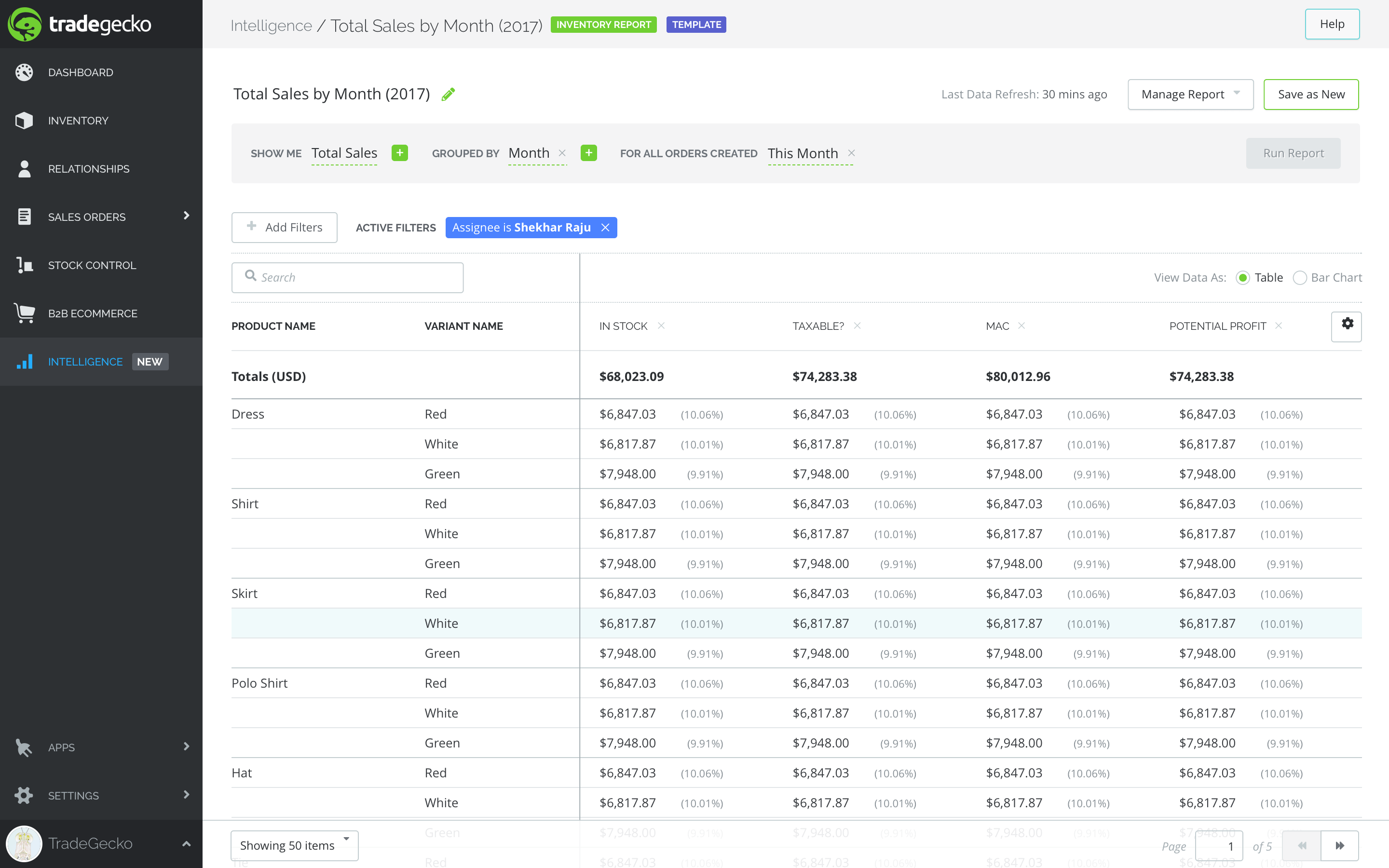
On the report generation side, keeping in mind the difficulty users were facing with the previous interface, I tried to make it more friendly by using natural language - Show me X grouped by Y For the period of Z. They can then run the report and the resulting data is shown in the table below, which can be further filter down.
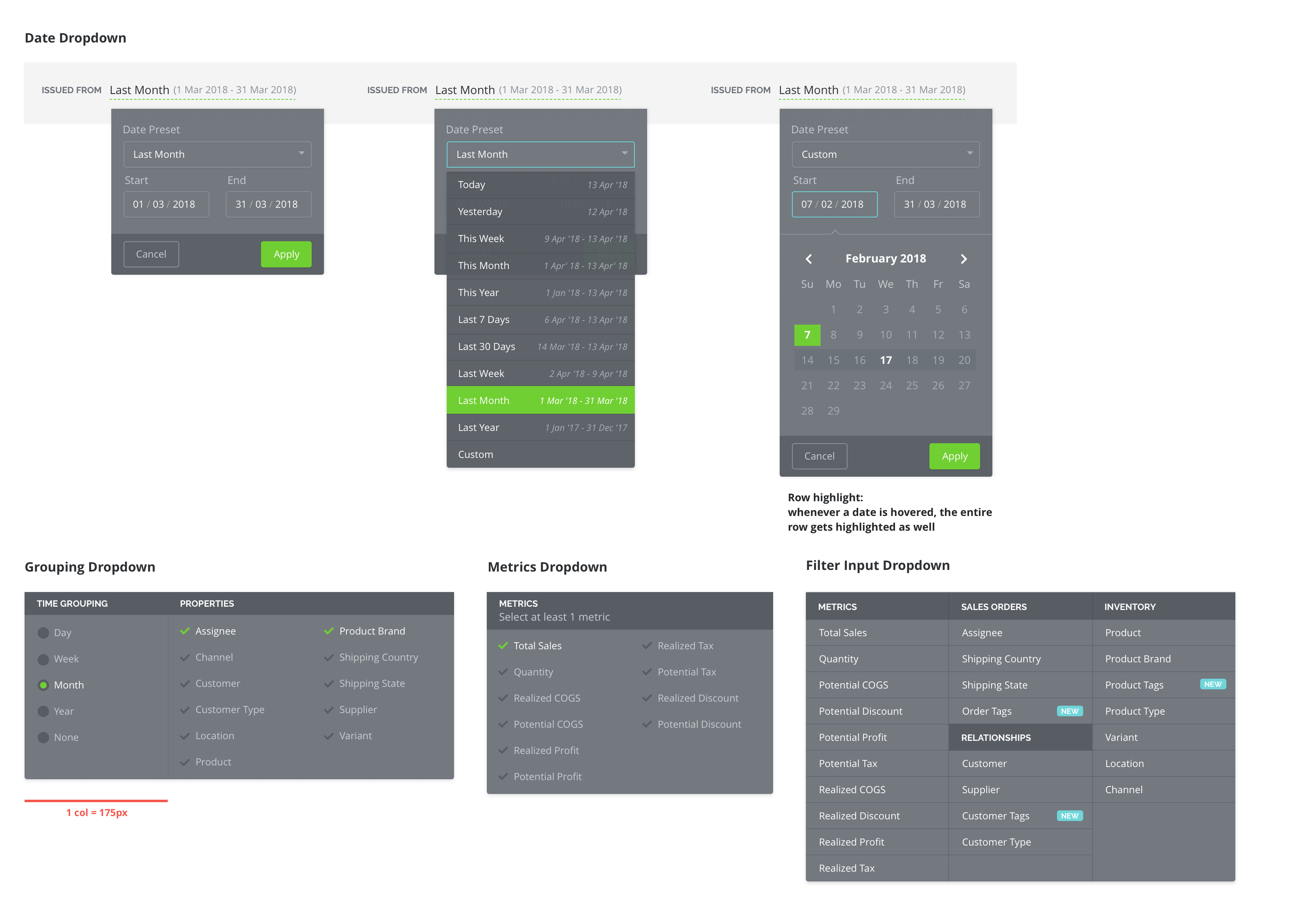
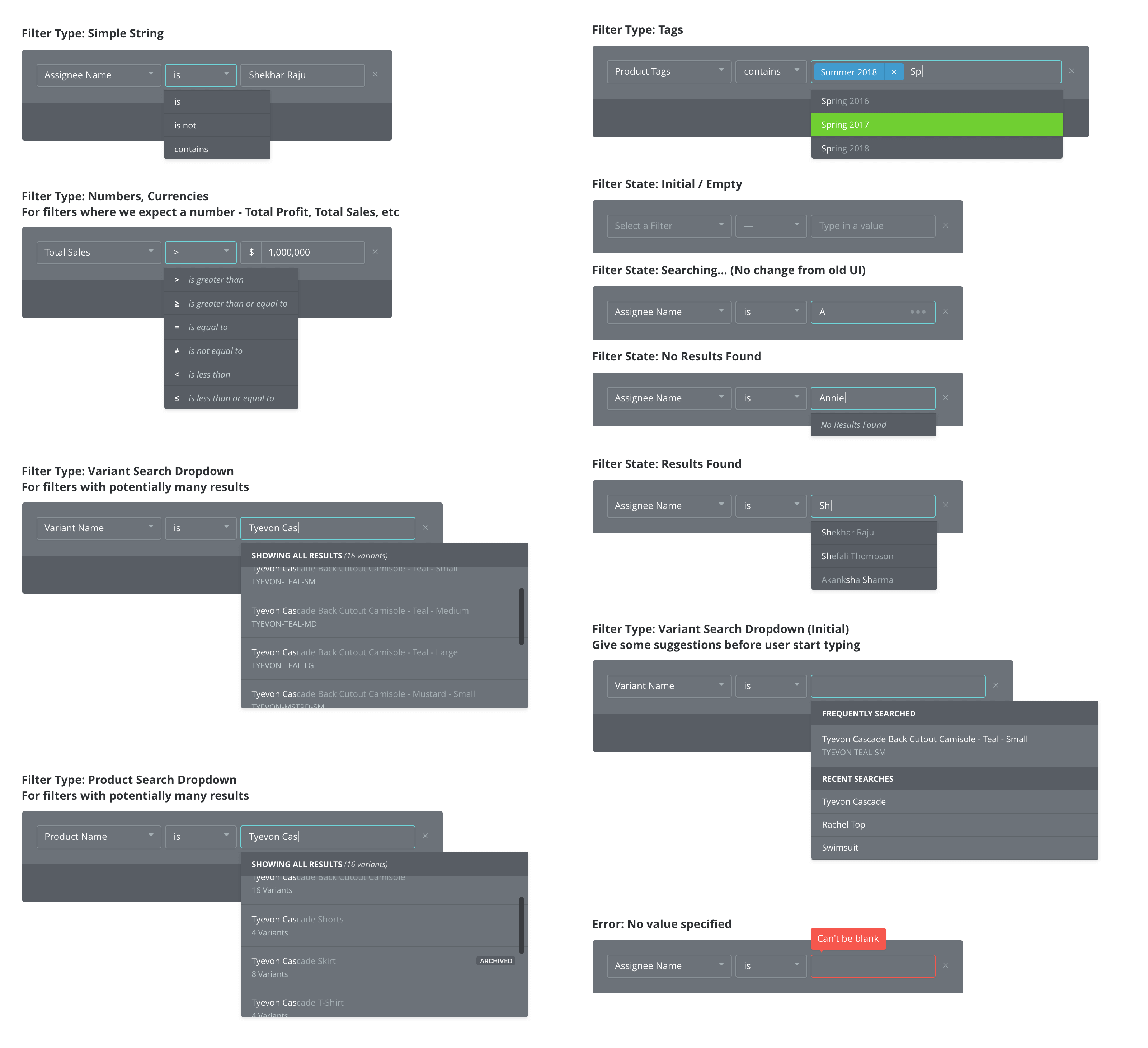
As we are dealing with many types of data, I've also designed different types of dropdown depending on the context of the reporting.
Template Reports
To make it easier for our users who may have just began dabbling on reporting, we created a few existing templates that are considered basic reporting for small businesses with multiple channels: Sales by Channel, Sales breakdown, Products sold by channel, Sales by cusomter, etc
They could then use these templates to customize their own report, and once a report has been customized with the filter and properties they wanted selected, customers can save these reports and pin them to the dashboard for easier access in the future.
Validating the Design
We reached out to 10 of our customers that meets the following conditions:
- Users that already use Intelligence / reporting on weekly basis
- New users that have just started using reporting
We conducted a 20-minute interview to ask them for their opinion on the new reporting UI as well as ask them to perform certain tasks on the new UI. We asked general questions such as "What is your first impressions on landing on the reporting page?" to usability questions to validate tasks on the new UI such as adding metrics, grouping reports, selecting time window, and filtering a report.
Learnings & Takeaways
1. Conducting user interviews / usability testing
From shipping this reporting feature, I learned the basics on conducting a user interviews: how to create interview questions, how to not ask leading questions, and how to synthesize a result from a user interview.
I wish that we could have the capacity to interview more than just 10 users, which we weren't able to do due to the fact that there were only 2 of us conducting interviews and that our user base were not large to begin with. I also wish that we could have included some customer interviews in the discovery process, which was not possible due to time and resource constraints.
2. Cost of engineering
I learned that I needed to balance the cost of engineering vs creating the experience I believed was correct. While the new reporting was well-received by our users, the development time could be shorter if I did not create new components and used existing ones instead.
If I were to go back now, I would focus on balancing more on creating the right look vs the development cost, for greater engineering efficiency and to match the appetite of the project. This is a lesson I still keep close to my heart til this day.
3. Saving the before / after state!
Lastly, I wish I had saved how the previous reporting looked like so that I can show you a before and after :)