Improving product discovery and recommendations in a B2B Marketplace
How might we fight against content fatigue and ensure customers are seeing fresh products when they visit Trada Marketplace?
Year
2021My Role
Lead Product DesignerSkills I Used
User ExperienceUser Interface
Rapid Prototyping
User Interview
User Testing

What is Trada?
Trada is an online wholesale marketplace that helps independent retailers purchase unique merchandise from local craft brands and makers. Read about how I helped build and design Trada from the beginning.
The Problem
As Trada started to grow, we discovered that our loyal customers were experiencing content fatigue - they were seeing the same products all the time on our static homepage.
My Role
I teamed up with my coworkers Shekhar (co-founder and Product Manager of Trada) and Celena (Product Designer). My responsibilities include:
- User Interviews - I led user interviews (4 out of 13 interviews) and assisted in note-taking in all the other interviews when not leading.
- Rapid prototyping - I used design system I've previously created for Trada to aid in making our prototyping process as efficient as possible. I also ran subsequent user interviews to validate the prototype and iterate based on feedback.
- Research Synthesis - Synthesizing findings from the user interviews.
The "Go Broad" Discovery Process
We started with a broad goal of improving the product discovery experience on Trada to increase the checkout rate.
Even though visitors are browsing Trada, only few would add products to cart and even fewer would check out. Out of all the visitors to the retailer homepage, 73% viewed a product page and only 42% added products to cart and 27% checked out their cart.
We first interviewed four customers and asked them broad questions:
- About their business and their motivation to start the business
- Reason to join Trada and their early experiences with Trada
- General discovery and buying process
- Trada discovery and buying process
Through the first four series of interview, we noticed four recurring themes that could indicate friction in product discovery or buying experiences in Trada.
- Retailers visit Trada at least once a week to browse for new brands and products. But they feel they’ve seen everything Trada has to offer as they keep seeing the same thing over and over again.
- Retailers want to try new brands, but are unsure if the brand is reliable (Will they ship as indicated on their lead time? Are their products truly made locally vs designed locally?) or whether they will enjoy working with the person behind that brand.
- Retailers are concerned about high minimums from certain brands, or if the wholesale price doesn’t have much of a margin. It’s can be too risky, as they don’t know if the brand will do well in their store.
Going Narrow
While most customers in the first four series of interviews agreed that Trada is the most convenient place to purchase, the actual share of wallet owned by Trada varied widely - from 10% to 100%.
We also noticed that all of the retailers stated that they come to Trada not just to buy, but also to browse and get inspired (once a week to daily). However, many felt they had seen everything on Trada as they keep seeing the same thing again and again.
We decided on go narrow on this problem: To inspire retailers to find new collections and help them zero-in on their next bestseller.
Rapid Cycle Prototyping & Testing
Next, we wanted to test a prototype in front of our users. Trada relies heavily on the look and feel of the website, so we skipped wireframing and went straight to high fidelity designs. As I have created a design system for Trada in Figma, it didn't take long to churn out high fidelity prototypes.
We spoke with 9 more customers for this purpose. In total, we spoke with 13 customers in 45-60 minutes interviews.
The result: Our Prototype

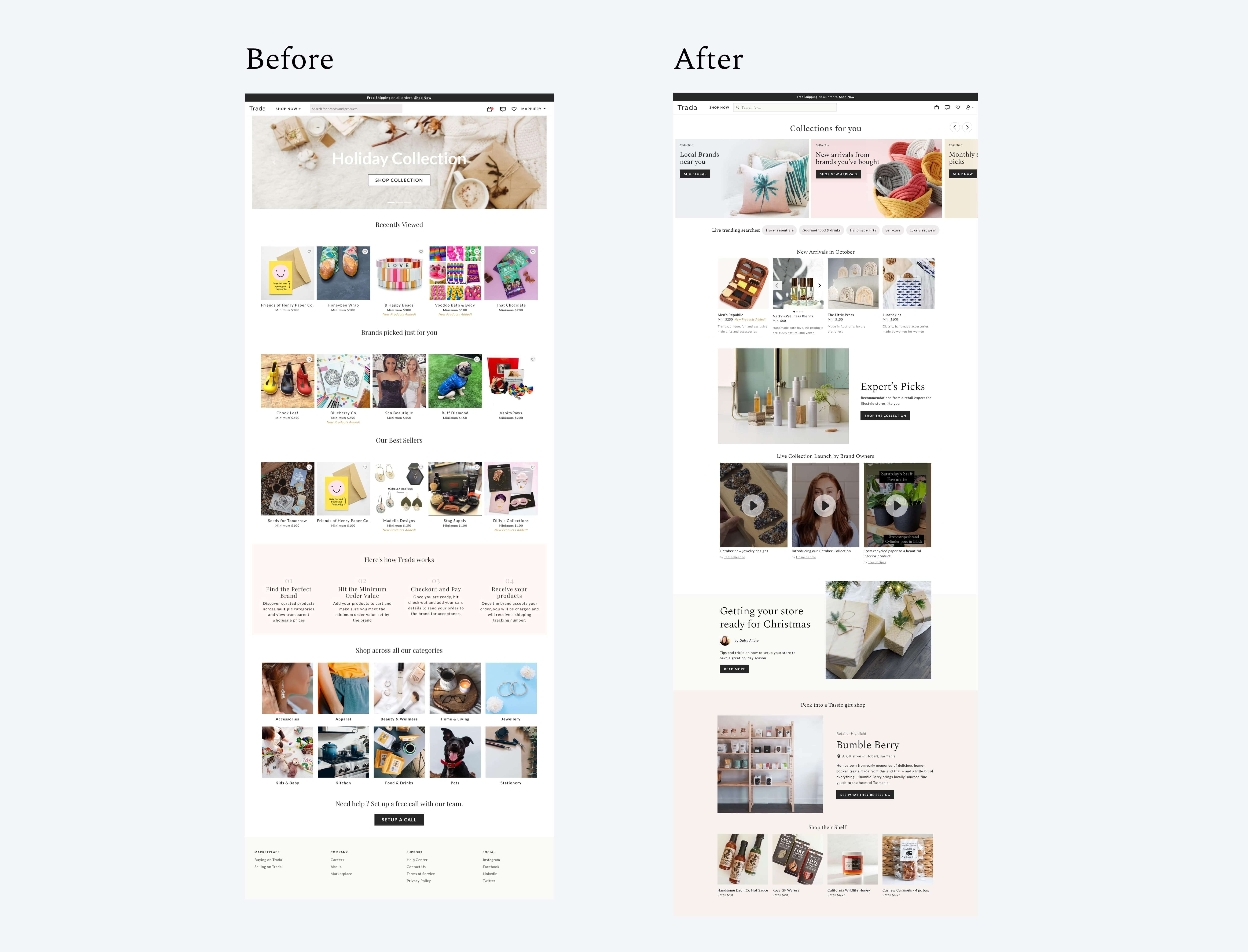
The prototype above shows the landing page for retailer, after the first page they see after logging in to Trada. A few things to highlight from this prototype:
- A "Collections for you" Carousel at the top of the page, personalized using data we know: their past purchases, brands they have bought from, and their location.
- Exploratory elements to aid discovery. "Live trending searches" pill to give them idea what is currently the hot products, "New Arrivals" to see what is new on the marketplace, "Expert's pick" - collection by experts, "Live collection launches" where user can upload an instagram reel style of video introducing their new collection launch, and blog posts.
- Retailer Showcase, which allows retailers to take a peek at what other retailers were buying, so they can get an idea of what products are selling well.

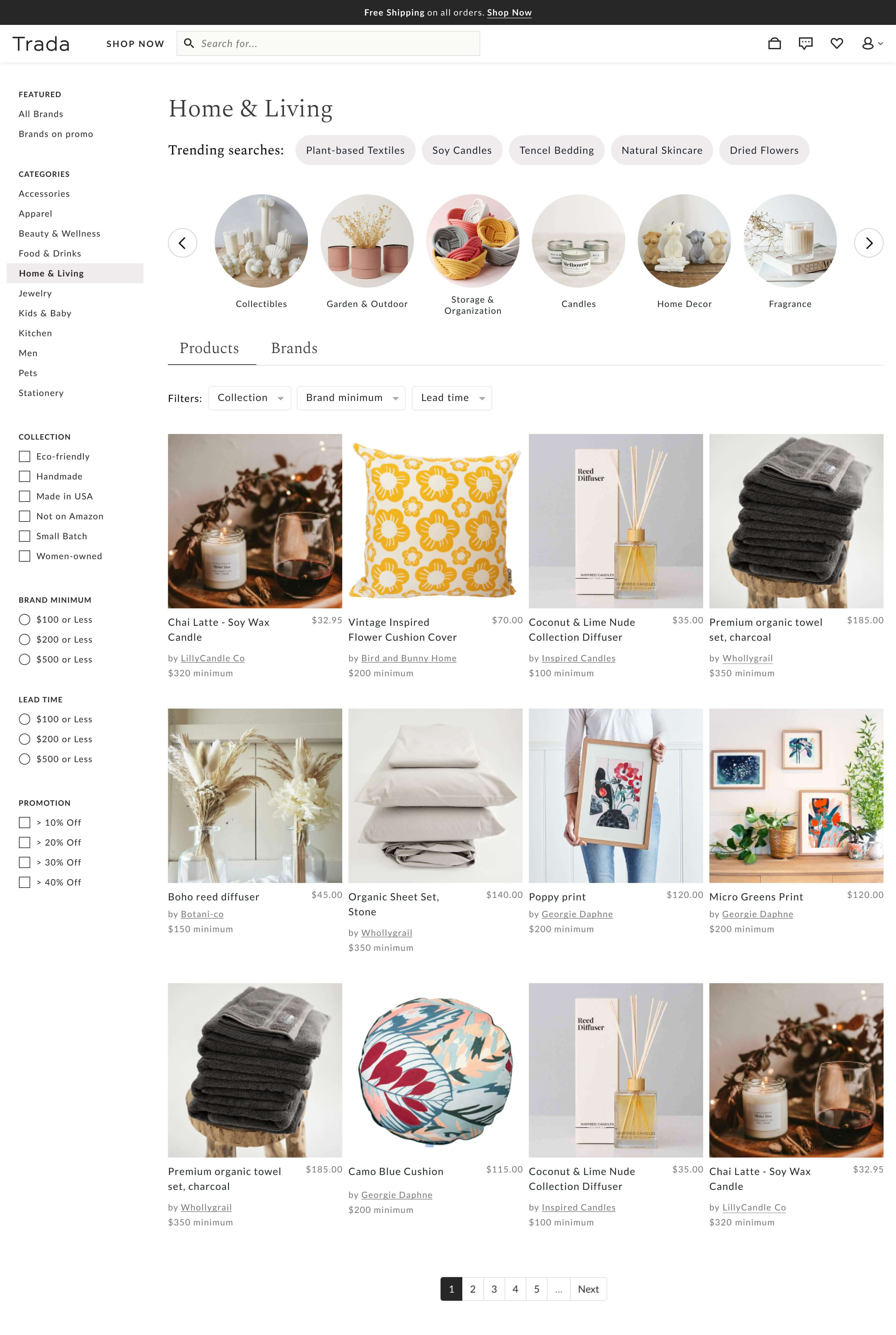
We also worked on the categories page, which is the page they see when they click into any categories on Trada. A few things to highlight from this prototype:
- Trending Searches at the top of the page, to showcase what's currently trending in Trada in that category.
- Subcategories Carousel and Filters at the top of the page, to help refine their search
- Product / Brand toggle to allow user control whether they wanted to browse by product or brand
Categories Testing
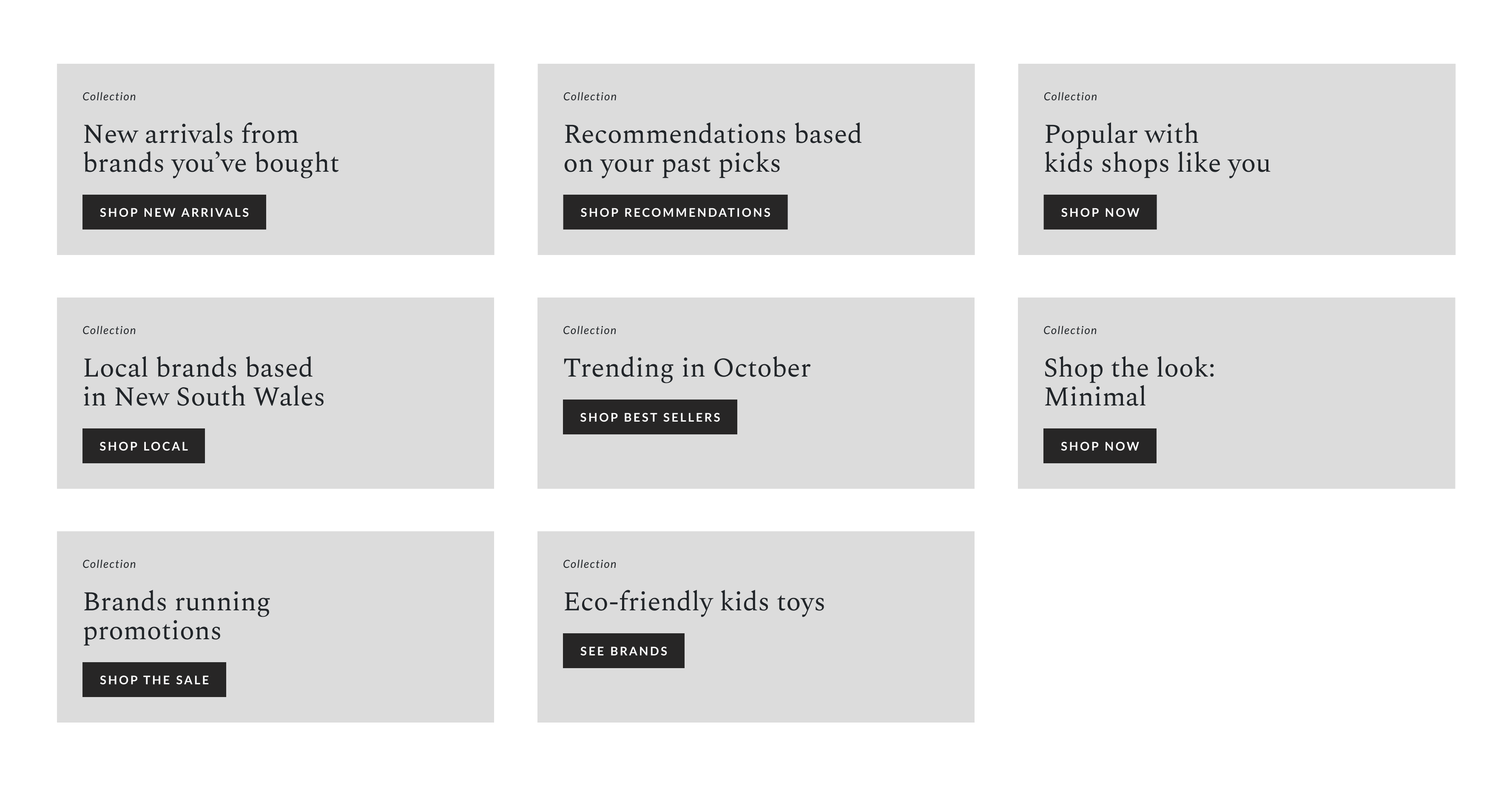
To support the top section where we are showing categories on the coursell, we needed to know which category caught the attention of our user. We showed 8 different categories to users and asked the first 3 categories that they would click on.

We researched each brand before the interview and manually put in relevant categories / location based on each brand, so that it felt more real to them. We also shuffled the cards with each interview to ensure the result is fair.
Learnings from testing prototype
After testing the prototype in front of 6 users, we learned that:
- Collections thumbnails. We need to make sure that the product images used on the collections can be purchased, meaning they are actual products from brands on Trada, and they are in stock.
- Retailer showcase. We can do more explorations here as some users we showed the prototype didn’t immediately understand what this section is about.
- “Live trending searches”. While users voiced out that they love this section, they weren't sure where the data was being pulled from. We need to make it clear if this is trending on Trada, or in general (e.g. social media)
Where Trada is now
Since its inception in 2019, Trada continued growing to be one of the major players in the B2B marketplace of Australia. In 2021 and 2022, I had the chance to continue my work further in Trada - one of them was the initiative to reduce cart abandonment. Unfortunately, due to company direction change, Trada was closed down in July 2023.